2008-12-22

Merry Christmas Post


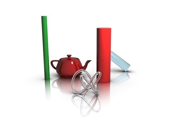
My render from Jeremy Birn's lighting challenge


'ello 'everybody, and merry christmas, and all that Jazz!


Yes, I'm back from SIGGRAPH ASIA in Singapore. I couldn't get so much net connection so there wasn't much of the promised "reporting"; I apologize profusely. For the totally curious, there are some random pictures here and some cellphone video here.

SIGGRAPH ASIA was overall a very nice experience. It was small (Pixars Tony Apocada compared it to "US Siggraph 10 years ago") which was a good thing - the US SIGGRAPH's tend to overwhelm. Only drawback of Singapore; drinks way too expensive ;)

And there was an Electronic Theatre (see last post)!

The Masterclass went very well, many special thanks to Mike Seymour from FXGuide who not only was my MC for the Masterclass, but also kept up with my 175 page powerpoint, and knew which page I had to return to when Powerpoint decided to crash yet-another-time. Note to Self: Keynote, pre-prepared DVD, or anything... ANYTHING but Powerpoints next time!

Speaking of next time, unless the economy implodes further, I'm tentatively signed up for doing a class next year in New Orleans. Nothing signed up for next SIGGRAPH ASIA in Yokohama, Japan, though.

For me, I will be trying to spend the remaining shivering pieces of the year w. my family, enjoy the festivities, eat the stuff we Swedes eat, and celebrate the most holy thing on Swedish Christmas: Donald Duck.

I part with a little Christmas Gift from (again) my friends at Blur Studios (who I must add was a great help in providing me with eyecandy for my Siggie presentations); you may recall I posted a while back about an event where they talked about their Warhammer cinematic. Well, this event was filmed and is now available online, clikety here and enjoy over 2 hours of rendering, animation, crowd/hair/cloth sim, modelling and rigging geekiness!

With that, I bid adieu for 2008.

Marry X-mas and a happy new year!

/Z

2008-12-13

Electronic Theatre FTW!


I sit here outside the Eletronic Theatre at Siggraph Asia 2008 posting this, waiting to get in. The Electronic Theatre has always been a cherished Siggraph event, the highlight of the entire conference.

Yet, this year, in Los Angeles, there wasn't one. In the opinion of me, and many others, this was a disasterous move.

My good friend Mike Seymour from FXGuide (who was also nice enough to MC my Masterclass) has started an online petition to bring it back, so when we go to New Orleans in 2009, this Gem of the computer graphics industry will be back in it's proper forum, to spread the digital joy we all so desperately crave (oh, how poetic!).

So please, if you are a Siggraph nut, head over to and sign it.

Thanks. I'll now go in and enjoy the show...

/Z

2008-12-10

Singapore Setup Session

Duncan Brinsmead

I arrived alive and well in Singapore, almost immediately ran into Duncan Brinsmead from Autodesk (pictured here on the left) and since we had some free time we walked around Singapore, and even took a trip on the "Singapore Flyer", which is the Singaporean version of the London Eye thingy.

As it happens, both Duncan and myself are doing presentations at tonights Autodesk User Group event.

So for us, today is "Teh Big Setup Day" for this presentations, as well as the booth theatere stuff.

For most of the week, I'll be alternating between the Autodesk and NVidia booths. I also hear Autodesk is streaming their booth theatre presentations over the net this year (see link below).

Convention Center

On Friday december 12:th, the 3 hour version of my "Miracles and Magic" mental ray masterclass will be held. It's in the convention center, but note it's an Autodesk masterclass and hence requires a ticket beyond the siggraph one.


More information on User Group event, Masterclasses, and Streaming..


/Z

2008-12-07

Up up and away....

2008/12/07

I'm at the airport awating my first airlift enroute to SIGGRAPH ASIA in Singapore.

As a precaution, I took the photo on the right of my bag, so if it gets lost, I can show people what it looks like ;)

Smaller updates of my travels and wherabouts will be on Twitter, so follow me there, please.

If I am in Wifi range, I may show up on the FRING thingamabob on the right side.

Also, there may be QiK updates now and then.... stay tuned, same zap time, same zap channel....


/Z

2008-12-03

Event: December 4:th: An Evening with Blur Studios

On thursday, december 4:th, 2008, Blur Studios will hold a presentation about their "Warhammer Online" cinematic, and how they used mental ray for all of it.


The event is in Hollywood, CA, and is free of charge.

Details are here.

UPDATE: The event is now online here

/Z

2008-11-21

Singapore Sling: SIGGRAPH ASIA 2008

In December, I am flying to Singapore to attend SIGGRAPH ASIA.


Singapore. I think.


This will really be my first visit to this corner of the world, so it will be interesting. Assuming the current planning remains, you can most likely find me around our mental images corner of the NVidia booth, as well as doing mental ray demos in the Autodesk booth. I'll be tweeting as well, as usual.

Among other things, one thing I will be doing at SIG' ASIA is to do a re-run of my masterclass from SIGGRAPH 2008 in Los Angeles, entitled "Miracles and Magic".

It was clear I had tried to cram way too much stuff to fit in the 1.5 hours I had; I had to skip every single live demo, and leapfrog little gems to just to get through it all. But I did get through it all, at a breakneck pace.

The Audience looked somewhat like this:


So... the idea here is to re-do pretty much the same masterclass, but as a 3 hour version. This would give us a more ... relaxed... pace, and the demo bits would actually fit!

So, to be totally clear. If you were at my Autodesk masterclass (not the "SIGGRAPH Course" on "HDRI for Artists") held at the Westin Bonaventure in Los Angeles, you already saw this, but very ... quickly. :)

So if you weren't in L.A, and are interested in the same topics, feel free to attend. The blurb for the class reads as follows:


  • The course will focus on photo-realistic rendering in mental ray in the context of visual effects, as well as for product and architectural visualization. The session will open with a quick introduction to photometric concepts followed by a practical guide to a linear workflow and why proper gamma correction is imperative. It will then move on to efficient techniques for achieving highly realistic results when combining CG and live action by combining existing tools together (e.g. the architectural and production shader libraries), techniques for rendering flicker-free animations with Final Gathering, and tips for conserving memory.


For more information about attending the Autodesk Master Classes, go here.

/Z

2008-11-05

The Joy of a little "Ambience"...

As usual, when the same question pops up in multiple places, I tend to turn this into a blog post. The question I was asked recently was how to use ambient light in mental ray (specifically, in mental ray in 3ds Max), because people were confused about the lack of an "ambient" slot in, say, the mia_material (Arch & Design) shader.

I will try to explain this here.

THEORY: "Ambient Light" and "Occlusion" - a primer


Back in the day...


Traditional computer graphics, with no indirect lighting of any kind, would by default look like this; here's a scene lit with a single shadow-casting directional light:
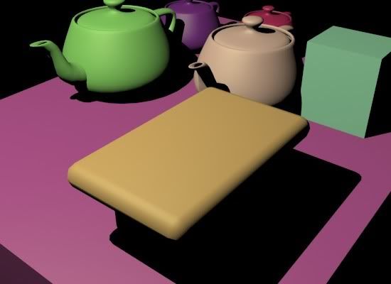


I.e. shadows are pitch-black, with no realism whatsoever. You can't even tell that the yellowish rectangular thing at the bottom is a table that has legs!

So a couple of tricks were introduced. One ugly, unrealistic hack was "shadow density", i.e. the ability to say "when light from this light is in shadow, only x% of it actually disappear". So you could set things like "Shadow Color" and "Shadow Density", which you all understand is completely absurd and totally contrary to any form of sanity and logic.

An opaque object either blocks light, or it doesn't - it doesn't just randomly go "Oh I block 47% of the light". That can't happen (outside of actually transparent objects).

RULE#1: Never, ever, no matter how "old-school" your rendering techniques are, use "shadow color" or "shadow density" settings. Ever. Trust me on this.

Enter "Ambient" light


"But", these early CG people said, "outdoors shadows from the sun is slighlty blue, shouldn't I set a shadow density and color to get my blue shadows"?

NO!!

The reason "shadows are blue" is because they are filled in by blue light from the sky.

Now, our early CG pioneers understood this, of course, so rather than the horrendeos hack of "shadow color", they introduced a nearly-as-horrendous hack: Ambient Light.

But the problem was, this "Ambient Light" was ever-present and uniform, and yielded a totally unrealistic and unsatisfactory result when used on it's own, something like this:
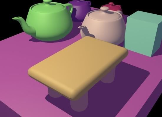


That looks about as horrible as the original: Sure, you can see something in the shadows - but it's all totally uniformly lit. The "legs" of our table can now be seen... but as totally uniformly colored blobs, with nothing to reveal their shape.

Are these round legs, or are they flat oval things, or what are those? Does the legs touch the floor, or are they hovering above it? The purple teapot looks almost flying, because the shadow behind the green teapot is just a flat color.

The problem here is that light is hitting every point uniformly, with no regard to the position or angle of the surfaces. But if we are trying so simulate "blueish light from the sky", then a point that is exposed to a lot of the sky will receive more light, than a point that is beind a bunch of other objects that are blocking (i.e. "occluding") the skylight.

Enter "Occlusion"


Luckily, some bright people at ILM back in 2002 when they were working on "Pearl Harbor" invented (using mental ray, I should add) something called "Ambient Occlusion". Basically, they wrote a shader that figure out how "occluded" a certain point was, i.e. how much stuff was "blocking light from arriving" at that point. This "Occlusion" on it's own looks like this:
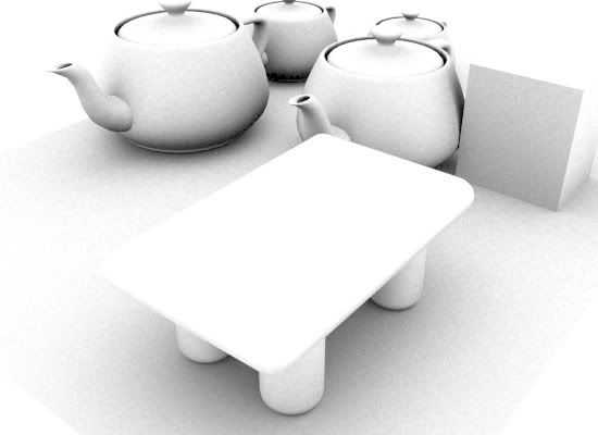


Combining "Ambient" and "Occusion"


Now, if you apply this to the Ambient term, you get this very much nicer image:
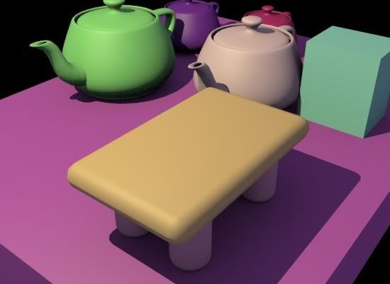


See how beautifully the details resolve; the legs of the table now correclty reads as "contacting" the floor; the shape of the legs can be perceived. The area between the teapots is properly darkened, and the teapots have nice contact shadows.

The above is how it should be done!

Doing it the WRONG way


However, unfortunatly, many people have read and misunderstood the original ILM documents on Ambient Occlusion, and apply the Occlusion pass across the entire rendering. This is W R O N G!!

I.e. people make "plain" render (including ambient light and everything), make an occlusion pass, and just multiply the two in post!

The result is that you get a deceptively-sort-of-okay-but-somwhat-wrong looking result like this:
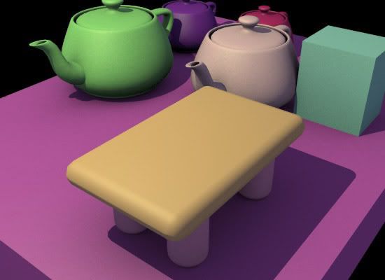


Notice how this has a "dirty" feel. This is because the occlusion pass (pictured above) was applied on top of the entire image, affecing the "ambient" light as well as the directional light.

But this makes no sense; the "occlusion" of the directional light is already taken into account - that's what the shadow of the light is. Ambient occlusion isn't called "ambient occlusion" for no reason; it's supposed to be applied to the "ambient" term, i.e. the "omnidirectional surrounding light", not to any direct lights.

But in the above image you will see darkening on floor in front of the objects, making it appear "dirty". Similarly, there is a bad looking "dirt-shadow" of the teapots spout on the front of the teapots. And so on.

SO: Globally multiplying occlusion on top of the beauty pass (including reflections, direct light, etc) is WRONG. Don't do it.

But isn't this all fake? Why are we doing it?


Now... all we are doing with our "ambient" light and the "occlusion" is simulating "omnipresent light" (i.e. light from the environment) as well as "bounce light" (from other objects). Lets compare the result with actually calculating omnipresent light and bounce light; i.e. use Final Gathering and calculate it FOR REAL:
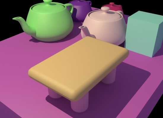


The above image uses FG and a 3ds Max "Skylight" (i.e. light from the environment in XSI or Maya) to introduce the same kind of light we tried to "fake" with the "ambient" light - but correctly. And with true indirect bounces!

So this results begs the question; when we so easily can get the correct result, why would we still want to go the "fake" route?

There are a couple of answers:


  • FG is an interpolated technique. This means that the indirect lighting is sub-sampled (calculated less than for every pixel) and the values between those are interpolated. However, if you are doing an animation, and the result between two frames are slightly different (for whatever reason), this may - hypothetically - cause not one pixel to change, but a large area of pixels to change (i.e. all pixels influenced by the interpolation of that FG point).

    The result, in a final animation, will be visible flicker. Visible, because it is "macroscopic", i.e. larger than a pixel, and perceived as "scintillation" or "flicker", which is visually unappealing.

    Contrast this with using the occlusion technique: It is calculated for every pixel (every sample, even), and hence, any noise in this calculation is of sub-pixel size. I.e. a difference from one frame or another will only affect at most one pixel, and mostly just a fragment of a pixel.

    The result is that this perceived more as "film grain", and is much less visually objectionable.


  • We may actually want to combine both "real" and "fake"; this is a method I often advocate.

    You use FG at a low density and with high interpolation, and you apply your occlusion on top of this indirect light, rather than some homemade, arbitrarily invented "ambient" light. This relieves you of the responsibility of having to figure out the proper intensity and color of this mythical "ambient light" - it is calculated for you.

    And of course, this combo method is a built in as a feature in Arch&Design/mia_material...


PRACTICE: How do we actually do this?


Since the original questions was in a 3ds Max context, I will answer (for now) in a 3ds Max context, but also mention the methods for XSI and Maya in the text.

There are three basic methods to apply ambient light:

  1. Use the built in AO of Arch&Design/mia_material and utilize it's "Ambient" parameter
  2. Use a light set to "Ambient Only"
  3. Use a light with the Ambient/Reflective Occlusion shader as light shader.


Method #1: Arch&Design (mia_material) ambience


This method allows you either per-material or global ambient light levels, and you can easily modify the ambient occlusion radius from the rollout:


  • Open the material in the material editor
  • Go to the "Special Effects" rollout.
  • Turn on the "Ambient Occlusion" and...

    • ...EITHER put in a given ambient light color in the material...
    • ...OR: switch to the "global" mode, which will use the "ambient" color and intensity from the Environment dialog box:
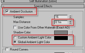


In XSI and Maya this means enabling the built in AO of mia_material, and setting the "ao_ambient" parameter to the color of your desired ambient light.

Method #2: "Ambient Only" light


(AFAIK, this specific method only works in 3ds Max. Correct me if I am wrong.)


  • Create an Omni
  • In it's Advanced rollout, set the light to "Ambient Only"
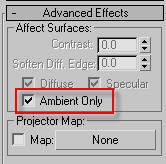


This gives you plain (flat) ambient light with no occlusion.

To get the occlusion effect by adding the Ambient/Reflective Occlusion shader as the "Projector Map" of the light.

BUT - There is a big BUT - For this to work, you MUST have the light with it's transformation reset, i.e. it must be placed at 0,0,0 in the top viewport, or the ambient occlusion shader will be confused.

Doing this manually is tricky; so it can be done much easier with a script:


myLight = Omnilight()
myLight.AmbientOnly = true
myLight.projectorMap = Ambient_Reflective_Occlusion__3dsmax()


To run this script:


  • Go to MaxScript menu
  • choose "New Script"
  • paste the above snippet in
  • hit CTRL-E


You will now have a set up light, where you can modify it's intensity and color etc. w. the normal 3ds max light features. The only thing you need to look out for is if you wan to set the distance for the ambient occlusion rays, you must


  • take the Ambient/Reflective Occlusion shader that is in the projector map
  • drag-and-drop it into the material editor
  • choose "Instance"
  • ...and modify the settings from the material editor


Method #3: "Ambient Only" light w. occlusion shader as light shader


There is actually a Method#3 which is similar to Method #2, except rather than placing the Ambient/Reflective Occlusion shader in the "Projection Map" slot, you use that shader as the light shader of the light itself.

A quirk of this methods is that now the shader completely replaces all the settings of the light; all controls for color, intensity, etc. stop working, and you need to do all changes to the light intensity and color by modifying the color of the "bright" slot of the occlusion shader itself (by putting it in material editor, as above).

This method has the benefit of not requiring the strange "light has to be in 0,0,0" requirement, plus that it is a method that works as well in Maya and XSI. To do this in XSI or Maya:


  • Create an area light
  • Set it's area light type to "User" and 1 sample
  • Use the mib_amb_occlusion shader as the light shader of the light


Similar to 3ds Max, changes to the "ambient light level" will now have to be done entirely from inside the occlusion shader.

Hope this helps.

Mo' later.

/Z

2008-09-18

White Out - those nice "product renders"

Here's a short tip: Did you ever want to be just like Apple? And render your products in a shiny magically white room, which still projects those nice magically faded reflections on the white surface?

To do this "physically real" is suprisingly tricky; you'll have all sorts of issues with the "white" actually either blowing out to superwhites, or the "white" in your reflections on the floor plane not looking "white enough" and if it does look "white enough" you can't just get that nice "faded reflection" look?

Well, here's where the production shaders can help you. Generally, you use the production shaders (specifically, mip_matteshadow) to apply differential shading to a background plate. I.e. if nothing is in shadow and nothing is reflected in the surface, the color returned is exactly the color you put in. Only when shadow falls is it darker, and if an object is reflected is the color actually touched.

But nobody said the background plate has to be a shot of your backyard. It can just be... well... plain old "white".


In this scene, the "floor plane" is using mip_matteshadow with a plain white color. The scene background is set to white. Traditional lights are used to light up the "CG objects" with traditional non-physical 0-1 intensity ranges. The reflections in the mip_matteshadow material is set to be subtractive, and to fade out over a given distance.

Et voila - you get this nice kind of render that you are used to finding on something like Apple store. Naturally, you can utilize the various Ray Switchers in the production library to allow the reflections in the objects to appear differently (i.e. a HDRI environment or somesuch) while the background still is just "white".

/Z

2008-09-05

Blur Cinematic update

A short update: There is a very cool thread over at ZBrush Central about the Blur Warhammer Cinematic mentioned in previous post, which is well worth a read.


On the topic of "random interesting links", I found this page oddly compelling; about a russian guy who invented a color photography process 100 years ago, and only now are the images actually - through the magic of computers - viewable again.

/Z

2008-08-24

Blur goes "mental"

Check out this new "Warhammer: Age of Reckoning" cinematic the insanely talanted guys at Blur Studios did:


It's done in mental ray (except some certain passes like particle work done in 3ds Max Scanline renderer (& maybe other renderers as well*)), and I even had the opportunity to render some of these characters myself, which was fun.

It's a suitably epic piece of work, I'd say.

What may interest people is that this is largely lit by physical sun&sky, and is using final gathering for indirect light. Clearly, the era of "fake everything" and "you can't use GI in production" is coming to a much needed close.

/Z
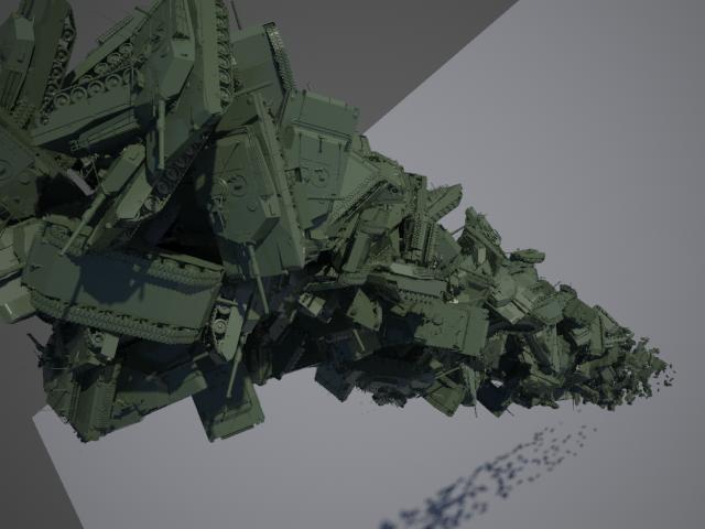
* = A ton of Particle work was done in FumeFX, which isn't available for mental ray quite yet. But a little bird has told me that this isn't too far into the future....

2008-08-21

The Post SIGGRAPH 2008 Post

Aaah, another SIGGRAPH done. This year was busier than ever, with both a course, masterclass and... stuff.

I'm still Jetlagged out of my head, even a week later, so this will just be a short post to say "I survived"... even the Blur party. :)

As you noticed (in previous post) the amount of QiK coverage I was able to do from the show was near nil - this was mostly due to lack of time but also rather shaky WiFi connectivity in the exhibition hall (it was fine in the conference areas, but who wants to see corridors? ;) ).

I must, however, take this opportunity to thank the guys of mymentalray.com who extended their hospitality quite extraordinarily to make me feel at home, especially Juan who gave me a little "tour".


mymentalray.com Maestro and Myself


While I was there I also visited my friends Colin & Greg at Hydraulx, in their new facility which I hadn't seen before. Verrry nice, their new screening room is sweeeeeeeeeeet. Me want ;)


Hydraulx screening room


/Z
2008-08-09

Leaving, on a jet plane....

2008/08/09

So I'm pretty much at the airport, about to embark on the god-knows-how-many-hours flight to L.A, arriving, nice and toally jetlagged out of my head at about 4 PM saturday.

More stuff on Twitter & Qik, and sometimes I may appearn int he "fring" thingamabob on the right. Maybe. If that works. Who knows w. technology. :)

/Z


2008-08-01

mrMaterials.com & The Floze Tutorials

mrMaterials.com


Last week, the site mrmaterials.com opened officially to the public, so you can actually up- and download materials there as well as (like I mentioned in my last post) mymentalray.com. So don't be shy, up & download those nice mental ray materials as much as you like!


The Floze Tutorials


Florian Wild, most known as "Floze" online, has put together an outstanding set of tutorials for mental ray about rendering various types of environments. These are, in order:


Sunny Afternoon


Twilight


Moonlight


Electrical


Candle Light


Underwater


Florian has undoubtedly done a great job on these, and they are very good reading, and even though they are written for Maya, mental ray is mental ray, so the basic techniques can be transported to XSI, 3ds Max etc. just as well.

Luckily, Floze has already done the thinking for you here as well, and this is available in eBook format from www.3dTotal.com for £8.55 (which I think he is well worth).

Enjoy

Stuff


Siggraph is closing in. I plan to do a bit of "reporting" from it on twitter, (so follow me there), and I may even, if I get extra crazy, do some QiK coverage. We'll see....

...until next time - keep tracing. ;)

/Z

2008-06-27

Layer all your Love on Me, MyMentalRay, Material Libraries and.... Stuff

MyMentalRay.com


First, before I start todays post, I advise everyone to run over to the freshly updated mymentalray.com which has a brand new fresh coat of paint, an updated material library, dynamic content, and a lot of other spiffy stuff.


Take note especially at the start of the mental ray material library over there. It's not the only effort of it's kind. My pal Jeff Patton is involved with a second very similar effort known as mrmaterials.com.

Simple Layering


I keep getting questions about layring (probably sparked by the recent writings about Iron Man) where you want to use something like Arch&Design (mia_material) to give both a broad specular glossy highlight, and a 2nd layer of a much more shiny "clearcoat" style material.

Well, nothing is stopping you from doing exactly that. I made this Iron Man material (apologies in advance to Ben Snow, and to all you guys for my lack of modelling sKiLz :) )


This isn't high art, but is there to demonstrate the concept. In most applications like Maya and XSI, you can easily blend materials using various blending nodes. But I did this in 3ds Max, and it's a little bit more difficult in a sense. I used the 3ds Max Blend material for this.

The trick is to understand that the 3ds Max Blend doesn't just *add* two materials (that's what the Shellac does), but it interpolates between them. This is generally better, because you do not break any energy conservation laws! (Also it works with photons that way!). Shellac, while nice, makes it really easy to make nonphysical materials.

However, since you are working with Blend you will have to take this into account. Here is an example:


From left to right:

  • Left: A completely mirroring Arch&Design material
  • Center: A glossy Arch&Design material in "Metal" mode
  • Right: a Blend material using the above two and a Falloff in Fresnel mode as the blend map.


A couple of things to note about this:

  • The "common mistake" people do is to make one material that is a shiny material with a falloff for the clearcoat, and completely reflective (glossy) material for the "base" material, and then try to blend these two with Shellac.

    This very easily causes nonphysical reasults on edges. Instead doing a Blend between 100% reflective and the "base surface" makes sure to keep the energy in check.

  • Note that for metallic colored objects, their color does affect the color of reflection, but for dielectric objects the reflection is always white.

    You do this by having the "Metal" mode turned on for the base objects (so reflection color is taken from diffuse color) but OFF for the clearcoat (which is a dielectric). This way you get the proper "uncolored" sharp reflections on top of "colored" glossy reflections.


In this particular "Iron Man" material, I also utilized pieces of the car paint shader to get the "flakes" (although the movie version didn't really have any) in the paint. For that I only utilized a single component of car paint (flakes) and had pretty much everything else coming from Arch&Design. For this reason I did use Shellac to layer the car paint with the Arch&Design.


More advanced Layering


This "Blend" technique can be used in multiple layers, witness this (again apologies for my modelling skills :) )


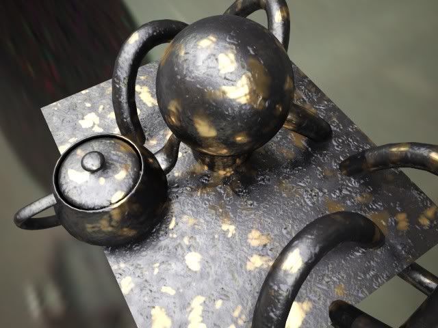
This image originated from a question I got about making "greasy brass", so I made this material (also available on mymentalray.com) which doesn't just blend two things together, but several. Without going too deep into the technique, I am blending between the metal layer, and two different "grease" layers, here with different bump maps.

The trick to keep straight in your head is to make each "layer" look as if it was only made of the given sub-material, and let the blending between the layers handle the weighting (and, unless you "know what you are doing", avoid blendings where they sum up to more than 100%. This is automatic in 3ds Max when using "Blend" but in Maya or XSI - or in 3ds Max when using "Shellac" - it's easy to run amok with the levels)


As always with metal, having something interesting to reflect (i.e. some HDRI environment or similar). But I covered that in an earlier episode (see also here about glossy materials).

...and Other Stuff(tm)


In other news:


  • On popular demand I updated the new skinplus.mi file mentioned in a previous post so it now has a special version that does displacement. See the (updated) post.

  • For those who has missed it, go over to FXGuide.com where there is lots of cool coverage of the vfx business. Also, if you aren't subscribing to CineFex, well, then you should.


Thanks for listening. As always, following me on Twitter is a great idea, especially as SIGGRAPH draws closer. I'll be Tweeting my location regularly while in L.A.

/Z

2008-05-08

SIGGRAPH 2008 talks

Phew. I just finalized the course notes for my SIGGRAPH talks.


As mentioned before, I will be holding an Autodesk masterclass with the title of "Miracles and Magic: mental ray technology in Photo-real Rendering for Production". This will - on popular demand - be a lot about gamma and linear workflow (I actually clocked the pure presentation "talky" part on this segment alone at 30 minutes, sans practical demo bit!).

Beyond the LWF/Gamma stuff, it'll talk about CG/Live Action integration, and tips for rendering flicker-free animations, and some other stuff (assuming I can get through it all in time ;) ).

Unless things change, the masterclass itself is from 1:30PM to 3:00PM on Thursday, August 14:th. There is also a "QA with all the masterclass presenters" on Wednesday, August 13:th at 9:00AM that I will also participate in. The full agenda and more info is here.

Furthermore, I will also be co-teaching a SIGGRAPH course entitle "HDRI for Artists" together with Kirt Witte (Savannah College), Hilmar Koch (ILM), Gary Davis (Autodesk) and Christian Bloch (HDRLabs).

The class is set for Monday, 8:30-12:15 in room 502A.

To make it easier to track these things, I've added a twitter feed, plus I gave this place a new, short, easy-to-remember URL:

www.mentalraytips.com


Enjoy.

/Z

2008-04-24

Beauty isn't only Skin Deep: combining fast SSS with mia_material (A&D)

UPDATE 2008-06-27: The file is now updated to support also support displacement in a new 'SSS Fast Skin+ (w. Disp)' material

UPDATE 2011-02-04: This is now updated with correct paths for 2011 versions


The image on the right is by Jonas Thörnqvist, an increadibly talented 3d Artist, and it is created using the mental ray skin shader.

Seeing some recent work from Jonas reminded me that I made some promises back in the day in this blog about tips on how to combine the "fast SSS skin" shader with the nice glossy reflective capabilities of the mia_material (i.e. "Arch&Design" in 3ds Max speak).

The trick w. the skin shader is that it uses light mapping. So the "material" that uses it must connect both a "surface shader" (the one which creates the actual shading) and a "lightmapping shader" (which is what pre-bakes the irradiance to scatter).

This is a tad tricky to do manually, and for this reason the skin shader is supplied as what is called in mental ray parlance a "material phenomenon". Well, suffice to say... it does all the magic for you! You don't need to think.

However, in some applications (notably Maya) this is different, and the skin shader comes shipped as a separate light mapping node and shader node, and there are scripts set up to combine them. Similarily for XSI, there exists a "split" solution already.

But the poor Max users are left behind. Like tears in the rain.

This is because a "material phenomenon" can't easily be combined with other things... coz it's a "whole complete package". And due to the peculiar requirements of the skin shader, it will not work if it is a "child" of some other material (like a Blend material in 3ds Max, or similar). So it's a wee bit hard to do from the UI.

However, what is not hard to do, is to actually write a different Phenomenon! As a matter of fact it is so simple, that I thought people would hop about doing exactly that left right and center. And indeed, Jonas, mentioned above, done exactly that. Which is why his renders are so cool.

It so happens I've had a modified version of the skin phenomena cluttering my harddisk for some time now... I just havn't gotten around to posting it before.

So, without further ado, here it is. It's experimental. It's unofficial. It's unsupported. If it makes your computer explode, so be it. Don't say I didn't warn you. Making no promises it even works. Etc.

Take the file skinplus.mi and save in your 3ds Max mental ray shader include autoload directory, i.e. it's generally something like:

For 3ds Max versions 2010 or earlier:
  • c:\Program Files\Autodesk\3ds Max ????\mentalray\shaders_autoload\include\
For 3ds Max versions 2011 or later:
  • c:\Program Files\Autodesk\3ds Max ????\mentalimages\shaders_autoload\mentalray\include\
Just put the file there, start Max, and you'll have a new "SSS Fast Skin+" and a "SSS Fast Skin+ (w. Disp)" among your materials. From there on it should be fairly self-explanatory. I hope. Have fun. /Z
Jonas "Incredible Hulk"

2008-04-18

3ds Max 2009 released: mr Proxies and Other Fun Stuff

You may not have noticed, but a new release of 3ds Max has seen the light of day, known as "3ds Max 2009" (+/- a "Design" suffix).

"What, already?" I hear you ask. Yeah - indeed. This was a shortened development cycle to realign the release date of 3ds Max with other Autodesk products. Disregarding the marketing talk, it means that stuff had to happen in six months that normally takes a year. And being heavily involved in this release, I can say that I am still sweating from the workload....

For mental ray nuts such as yourself, there's some fun new stuff in 2009. Perhaps, most notably, is the hotly requested "mental ray proxies".


What is a "mental ray proxy", you ask?

mental ray proxies


Well, technically, it's a render-time demand-loaded piece of geometry. The particular implementation chosen for 3ds Max is in the form of a binary proxy. This means that the mental ray render geometry data is simply dumped to disk as a blob of bytes together with a bounding box. These bytes can then be read in... but not until a ray actually touches the bounding box!

Normally, geometry lives in the 3ds Max scene, and is then translated to mental ray data. So it means the object effectively lives twice in memory, once in 3ds Max, and once as the mental ray "counterpart". Not only does the proxies remove the translation time, it actually removes the need for the object to exist in all it's glory in 3ds Max; there is only a lightweight representation of the object in the scene, that can be displayed as a sparse point cloud so you can "sort of see what it is", and work the scene at interactive rates. Not until the object is actually needed for render is it even loaded into memory, and when it is no longer needed, it can be unloaded again to make room for other data.

One neat feature with the proxies is that they can be animated, i.e. mesh deformations can be stored (you can naturally just move the instances themselves around normally without having to save them as "animated" proxies, as a matter of fact, instance transformation is not baked into the file, only the deformations).

You can think of it as a point-cache on stereoids, because the entire mesh is actually saved - which means that topology changing animation (such as, say, a fluid sim) can be baked to proxies. Naturally, it'll eat lots of disk ... but it's possible. The animation can be re-timed and ping-pong'ed (so you can make, say, swaying trees more easily).

Making proxies


Now, creating proxies in the shipping 3ds Max 2009 is a bit of a multi-step process. I wrote a little script to simplify that, but it wasn't ready in time to make it into the shipping 2009, so you can find it here:


  • Download mental ray-mrProxyMake.mcr
  • Launch max, and on the MaxScript menu choose "Run Script" and pick the file. By doing this, it should now have installed itself.
  • Now open your "Customize" memory, the "Customize User Interface"
  • Choose the "Quads" tab
  • On the left, choose the category "mental ray"
  • In the list that appears, you'll find a "Convert Object(s) to mental ray Proxy". Make sure the one with the plural "s" on "Object(s)", if you find one without s it is the shipping one which is not so fun. ;)
  • Drag it to a quad menu of your choice - done!


Now you should be able to right-click an object, and get a "Convert Object(s) to mental ray Proxy" option.

This allows you to convert an object and replace the original with a mr Proxy. Note this removes your original, replaces it (and all it's instances) with the proxy. It retains all transformation animation, children and parent links in all the instances. Now be aware your original is thrown away - do don't do this on some file which you do not have a saved copy of your carefully crafted object!!!

You can also select multiple objects for baking to proxies. This, however, works slightly differently. Instead of just a filename, you are asked for a file prefix, and the actual object name in the scene is then appended to that name.... so if your prefix is "bob", then "Sphere01" is saved as "bobSphere01.mib".

Disclaimer


Now, this is an unsupported experimental tool. Be aware it will delete your original Object(s) - so save your original scene. It may have a gazillion of bugs, misfeatures, and may cause your computer to explode. There is no warranty that it'll even execute. But if you find it useful.... enjoy. ;)


What about particles? Pflow?


Now the next question I invariably get is this: Can you instantiate proxies as particles? I doesn't seem to work?

The story is this. Back in the day, 3ds Max had issues with handling many objects. Many polygons was easier for it to handle. And even today, I guess a million single-polygon objects will be much slower than a single million-polygon object, due to the per-object overhead.

Many (if not all) the 3ds Max tools, including particle systems, were written with this in mind. So, for example, instantiating an object into a particle system means that the mesh itself is copied. So when you have a box, and instantiate this into a particle system w. 1000 particles, this doesn't really make 1000 boxes. It actually makes a single mesh containing the faces copied off the 1000 boxes.

Since the mr Proxies aren't meshes (they have no geometry as seen from inside max, they are helpers), they can't be copied as meshes. It won't work!

Luckily, the planet is filled with Smart People. One of these Smart People is named Borislav "Bobo" Petrov, and if you've ever used a MaxScript, you've heard of him.

Naturally, Bobo has a solution. Check out this post on CGTalk, where Bobo posts a script which can bake any scene instance to a particle flow particle system.

The script creates real and true instances of the objects, rather than trying to "steal the mesh faces". And by virtue of doing true instances, it works perfectly with the mr Proxies.

I honestly have no idea what the 3ds Max community would even do without Bobo, he's such a phenomenal resource.

So, there you go. Have fun with 3ds Max 2009 and PFlow'in your proxies....

/Z

2008-04-04

Visual F/X tip: Blowin' Stuff Up

I just had to post this, coz' it's so useful. It's got nuttin' to do with mental ray, but hey, I like it, so I post it.... and you, dear reader, may very well be into visual effects, so....

Here's the thing:

My very good friend and certified "madman" Bob Forward has a site dedicated to downloadable stock pyro footage called Detonation Films.


I've used Bobs stuff in the past, I stumbled there recently and saw that not only has Bob upgraded to HD for a lot of his effects, he has lots more than I ever saw before!

There's explosions, explosions, bullet hits and explosions. There's blood, sweat, and tears. There's debris, theres smoke, there's fire.... there's perdy much anything you'd need, and all available for electronic purchase (w. a lot of cool freebies too)!

And there's also Kabumei, and Bob's other films....

Yes, this man is insane; he lives to blow stuff up, but he is sane enough to keep a camera nearby every time he does it...

So.... I just thought I'd throw Bob a plug, "just coz". And no, he ain't paying me for saying this (although that's an idea... ;) )

/Z

2008-03-24

Quick Informal Poll on Gamma Stuff


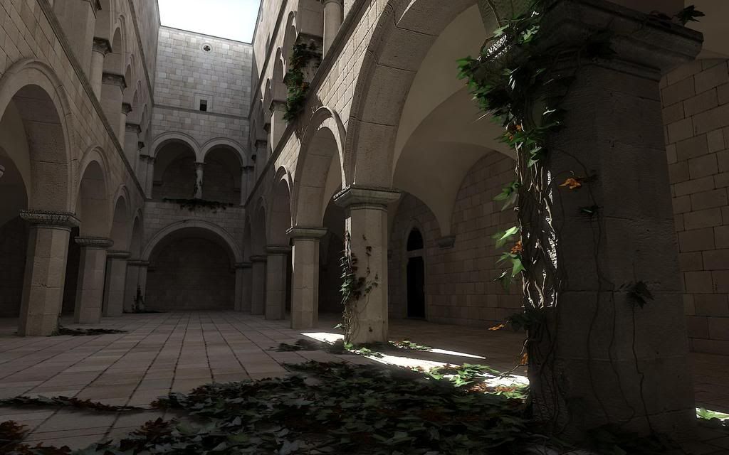
"Sponza Overgrown" (more here)

A discussion recently came up on CGTalk about gamma correction.

Since I have an Autodesk Masterclass at SigGRAPH 2008 which touches briefly on the subject, I was thinking if I should, by "popular vote", actually expand that section of the masterclass, perhaps shave off some other things and talk more about Gamma?

Technically, the agenda is already "set" but I could perhaps be flexible?

What do you think? Do you plan to go to SigGRAPH 2008 in L.A.? Would you attend the Masterclass, and if so, would you want to hear more about Gamma stuff? Or would you rather hear about the other things?

Please post a reply to this blog post with your preference.

To be clear: This question is about SigGRAPH in particular. Gamma is a topic I'll be adressing quite a lot here, to the point of making a whole website about it. So it's not like there will be any shortage of online info.

(Btw, I also co-teach on a "HDRI-for-artists" SigGRAPH course)

/Z

2008-02-19

Why does mental ray Render (my background) Black? Undestanding the new Physical Scale settings

The most common "complaints" I get about mental ray rendering in 3ds Max 2008 is "it's washed out" and "it Renders black". The answer to the former is "you are not handling your gamma correctly", and will be thorougly covered in the future. The answer to the latter is "You are not understanding the Physical Scale" settings. Which is what we're going to talk about now.

Color and Color


Without going too deep into the physics of photometric units (we did that already) we must understand that a normal color, an RGB value, i.e. a pixel color of some sort, can, fundamentally represent one of two different things:


  • A reflectance value
  • A luminance (radiance) measurement


The "luminance" of something is simply how bright it looks. It's probably the most intuitively understandable lighting unit. Basically, you can say that when you are looking at the pixels your digital camera spit out on your computer, you are looking at pixels as individual luminance measurements, converted back to luminance variations by your screen.

I.e. a given luminance of some real world object flows in through the lens of your camera, hits the imaging surface (generally a CCD of some kind) and gets converted to some value. This value (for the moment ignoring things like transfer curves, gamma, spectral responses and whatnot) is, in principle, proportional to the luminance of the pixel.

Now "reflectance" is how much something reflects. It is often also treated in computer graphics as a "color". Your "diffuse color" is really a "diffuse reflectance". It's not really a pixel value (i.e. a "luminance") until you throw some light at it to reflect.

And herein lies the problem; traditionally, computer graphics has been very lax with treating luminance and reflectance as interchangeable properties, and it's gotten away with this because it has ignored "exposure", and instead played with light intensity. You can tell you are working with "oldschool" rendering if your lights is of intensities like "1.0" or "0.2" or something like that, in some vague, unit-less property.

So when working "oldschool" style, if you took an image (some photo of a house, for example) and applied as a "background", this image was just piped through as is, black was black, white was white, and the pixels came through as before. Piece of cake.

Also, if you took a light of intensity "1.0" that shone perpendicular on a diffuse texture map (some photo of wood, I gather) will yield exactly those pixels back in the final render.

Basically, the wood "photo" was treated as "reflectance", which was then lit with something arbitrary ("1.0") and treated on screen as luminance. The house photo, however, was treated as luminance values directly.


But here's the problem: Reflectance is inherently limited in range from 0.0 to 1.0... i.e. a surface can never reflect more than 100% of the light it receives (ignoring fluorescence, bioluminescence, or other self-emissive properties), whereas actual real-world luminance knows no such bounds.

Now consider a photograph... a real, hardcopy, printed photograph. It actually reflects the light you shine on it. You can't watch a photograph in the dark. So what a camera does is to take values that are luminances, take it through some form of exposure (using different electronic gains, chemical responses, irises to block light, and modulating the amount of time the imaging surfaces is subjected to the available luminances). Basically, what the camera does, is to take a large range (0-to-infinity, pretty much) and convert it down to a low rang (0-to-1, pretty much).

When this is printed as a hardcopy, it indeed is basically converting luminances, via exposure, into a reflectance (of the hardcopy paper). But this is just a representation. How bright (actual luminance) the "white" part of the photographic hardcopy will be depends on how much light you shine on the photograph when you view it - just like how bright (actual lumiance) the "white" part of the softcopy viewed on the computer depends on the brighness knob of the monitor, the monitors available emissive power, etc.

The funny thing with the human visual system is that it is really adaptive, and can view this image and fully understand and decode the picture even though the absolute luminance of the "white" part of the image varies like that. Our eyes are really adaptive things. Spiffy, cool things.

So, the flow of data is:

  • Actual luminance in the scene (world)
  • going through lens/film/imaging surface and is "exposed" (by the various camera attributes) and
  • becomes a low dynamic range representation on the screen, going from 0-to-1 (i.e. from 0% to 100% at whatever max brightness the monitor may have for the day).


So, now the problem.


In the oldschool world we could draw a near equivalence between the "reflectance" interpretation and the "luminance" interpretation of a color. Our "photo of wood" texture looked the same as "photo of house" background.

What if we use a physical interpretation?

What about our "photo of wood"? Well, if we ignore the detail of the absolute reflectance not necessarily being correct due to us not knowing the exposure or lighting whtn the "photo of wood" being taken, it is still a rather useful way to reperesent wood reflectance.

So, if we shine some 1000's of lux of light onto a completely white surface, and expose the camera such that this turns into a perfectly white (without over-exposure) pixel on the screen, then applying this "photo of wood" as a texture map will yeild exactly the same result as the "oldschool" method. Basically, our camera exposure simply counter-acted the absolute luminance introduced by the light intensity.

So, in short, the "photo of wood" used interpreted as "reflectance" still works fine (well, no less "fine" than before).

What about us placing our "photo of house" as the background?

Well, now things start to change... we threw some thousands of lux onto the photo, creating a luminance likely in the thousands as well.... these values "in the thousands" was then converted to a range from black-to-white by the exposure.

So what happens with our "photo of house"? Nothing has told it to be anything than a 0-to-1 range thing. Basically, if interpreted strictly as luminance values, the exposure we are using (the one converting something in the thousands to white) will covert something in the range of 0-1 to.... pitch black. It won't even be enough to wiggle the lowest bit on your graphics card.

You will see nothing. Nada. Zip. BLACKNESS!

So, assuming you interpret oldschool "0-to-1" values directly as luminance, you will (for most common exposures) not see anything.

Now this is the default behaviour of the mr Photographic Exposure control!!


This setting (pictured above) from the mr Photographic Exposure will interpret any "oldschool" value directly as a cd/m^2 measurement. And will, with most useful exposures used for most scenes, result in the value "1" representing anything from complete blackness to near-imperceptible-near-blackness.

(I admit, I've considered many a time that making this mode the default was perhaps not the best choice)

So how do we fix it


Simple. There are two routes to take:


  • Simply "know what you are doing" and take into account that you need to apply the "luminance" interpretation at certain points, and scale the values accordingly.
  • Play with the "Physical Scale" setting


Both of these methods equate to roughly the same result, but the former is a bit more "controlled". I.e. for a "background photo" you will need to boost it's intensity to be in the range of the "thousands" that may be necessary to show up for your current exposure. In the Output rollout, turn up "RGB Level" very high.

Of course, in an ideal world you would have your background photo taken at a known exposure, or where you had measured the luminance of some known surface in the photo, and you would set the scaling accordingly. Or even better, your background image is already a HDR image calibrated directly in cd/m^2.

But what of the other method?

Undersanding the 'Physical Scale' in 3ds Max


When you are using the mr Phogographic Exposure control, and you switch to the "Unitless" mode...


...one can say that this parameter now is a "scale factor" between any "oldschool" value and physical values. So you can think of it as if any non-photometric value (say, pixel values of a background image, or light intensities of non-photometric lights) were roughly multiplied by this value before being interpreted as physical values. (This, however, is a simplification; under the hood it actually does the opposite, it is the physical values that are scaled in relation to the "oldschool" values, but since the exposure control exactly "undoes" this in the opposite direction, the apparent practical result of this is that it seems to "scale" any oldschool-0-1 values)


When to use which mode


Which method to use is up to you. You may need to know a few things, though: The "cd/m^2" mode is a bit more controllable and exact. However, the "Unitless" mode is how the other Exposure controls, such as the Logarithmic, work by default. Hence, for a scene created with a logarithmic exposure, to get the same lighting balance between photometric things and "oldschool" things, you must use the unitless mode.

Furthermore, certain features of 3DS Max actually works incorrectly, indeed limiting their output to a "0-1" range. Notable here is many of the volumetric effects like fog. Hence, if the "cd/m^2 mode" is used, it blocks fog intensity to max out at "1 cd/m^2". This causes things like fog or volume light cones to appear black! That is bad.

Whereas in the "Unitless" mode, the value of "Physical Scale" basically defines how bright the "1.0" color "appears", and this gets around any limitation of the (unfortunately) clamping volume shaders.


BTW: I actually already covered this topic in an earlier post, but it seems that I needed to go into a bit more detail, since the question still arise quite often on various fora.

Hope this helps...

/Z